Project | Impact
Purchase Flow UX Improvement
Redesigned the purchase flow by reorganizing essential information and pricing, increasing clarity range from 22% and 44% to 55% and reducing checkout drop-offs.
Contribution | Role
100%
Year
2025

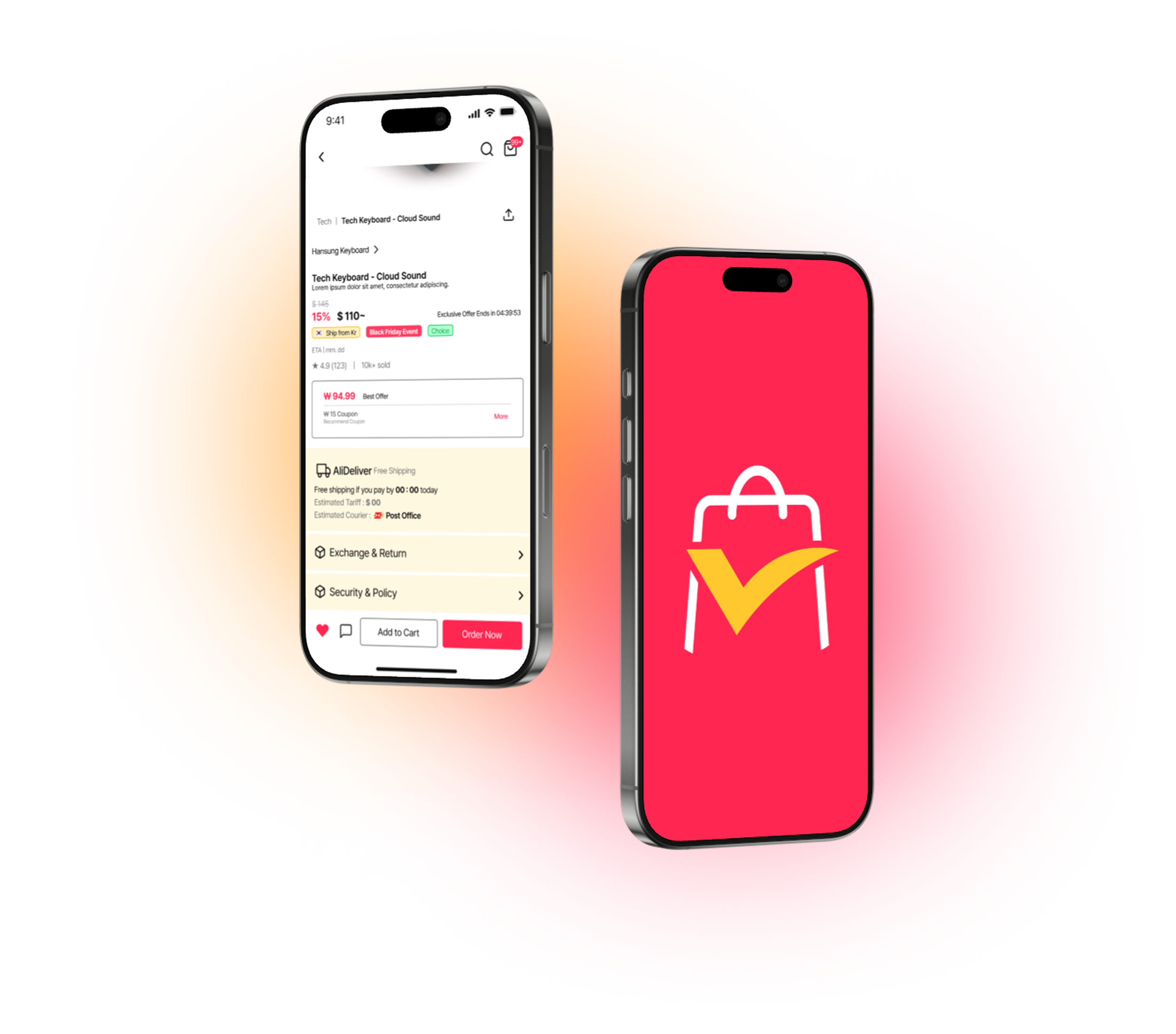
Do you use E-Commerce often?
You’ve found the item you want, the price looks right, and you're ready to check out—
but suddenly the information becomes unclear. Shipping? Fees? Delivery timeline? You’re not sure anymore.
That moment of hesitation is all it takes for users to leave.
For a platform built on global transactions, this uncertainty directly impacts trust, conversions, and revenue.
This project tackles that critical gap—
by redesigning the checkout experience to bring clarity, confidence, and continuity to the user’s final step.
BACKGROUND

DESK RESEARCH
COMPETITOR ANALYSIS

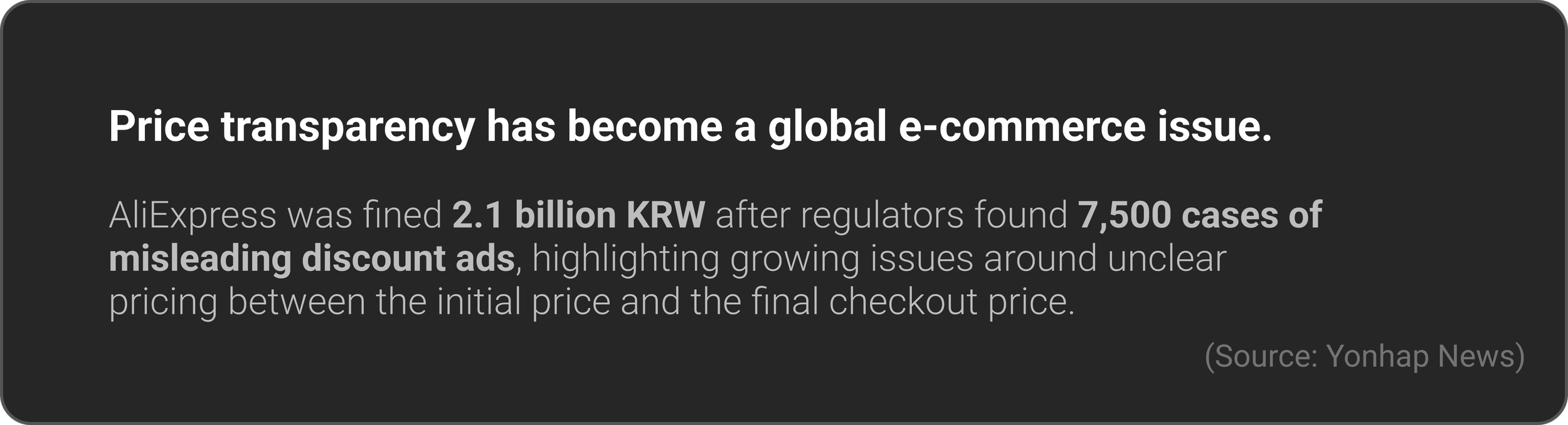
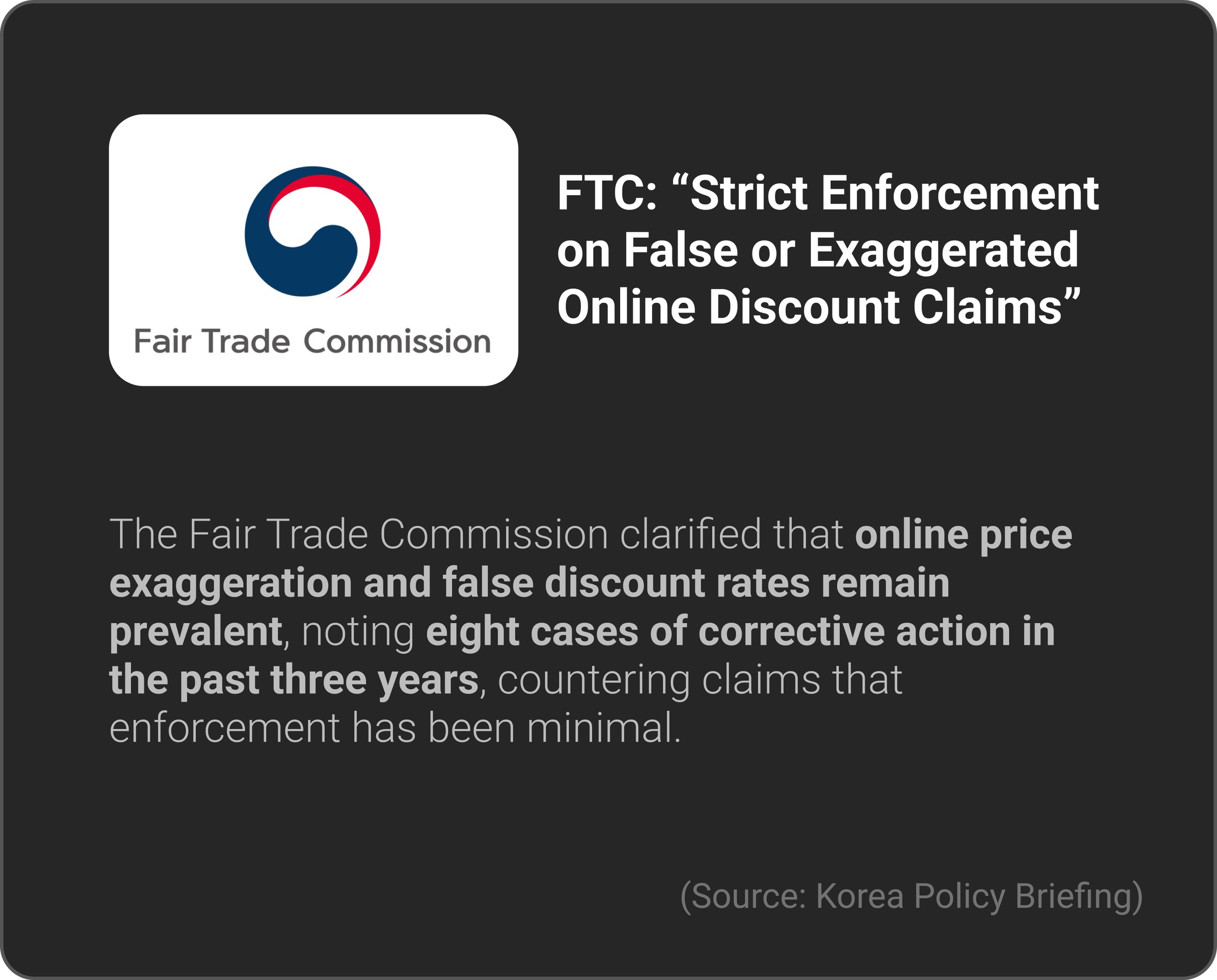
DARK PATTERN


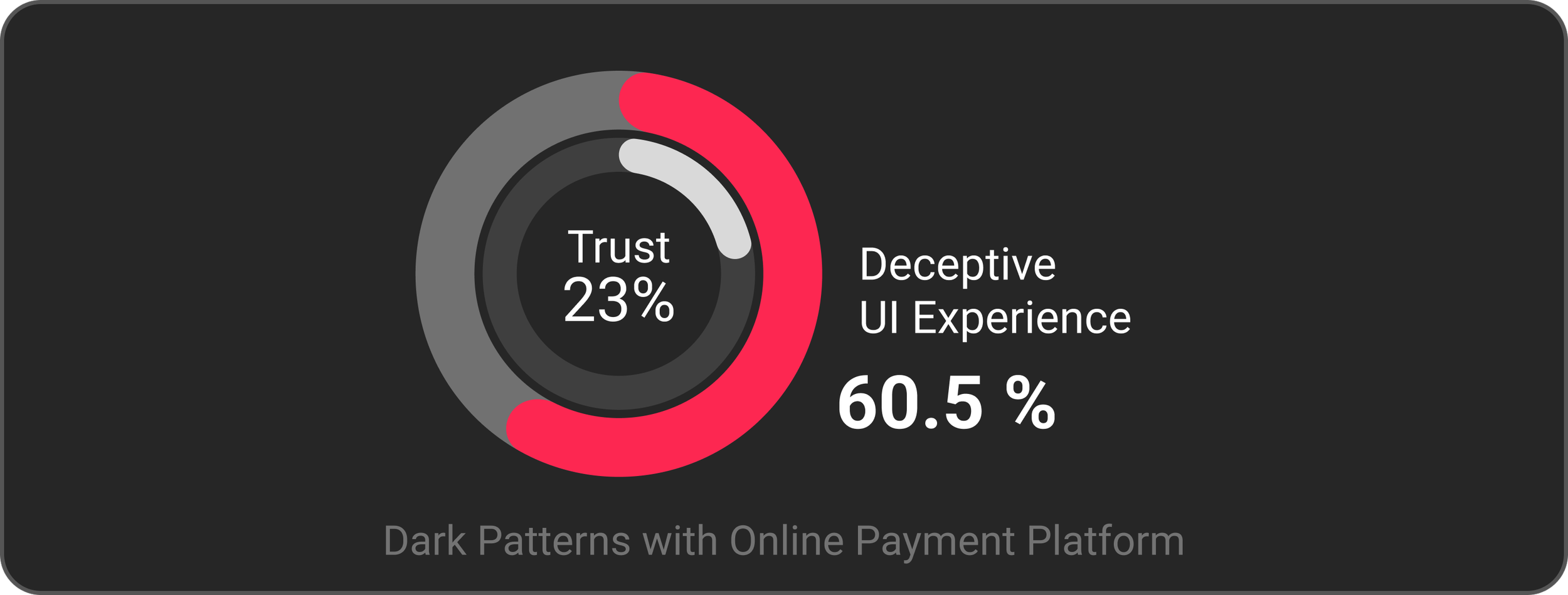
In particular, hidden fees and unexpected extra charges revealed
during the payment stage led to immediate user drop-off.
USER RESEARCH
SURVEY
20 Participated
09. 07 ~ 09. 10. 2025

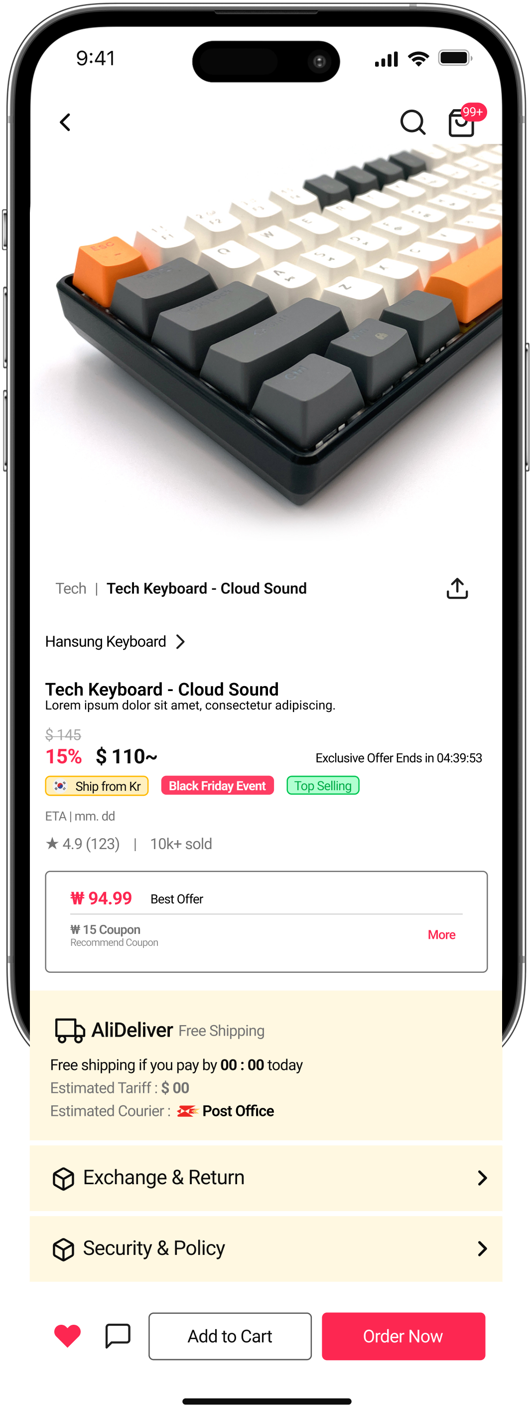
Users want to see essential purchase information—
product details, shipping, taxes, refund policies, and final price—clearly at a glance.
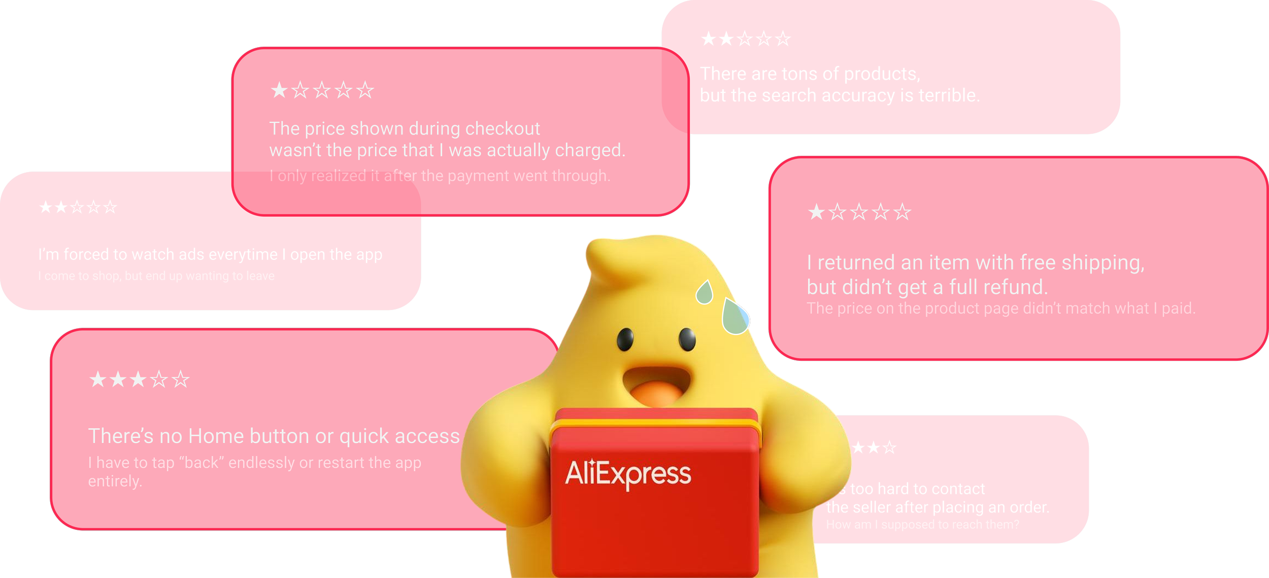
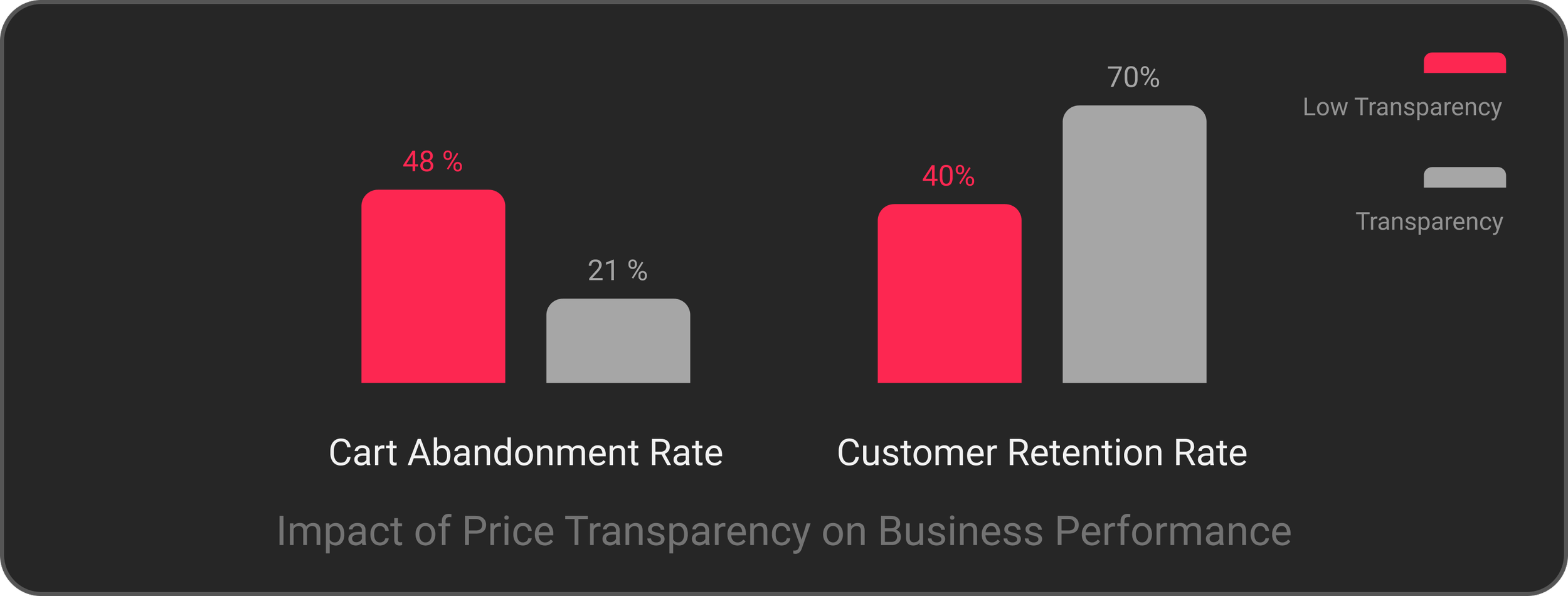
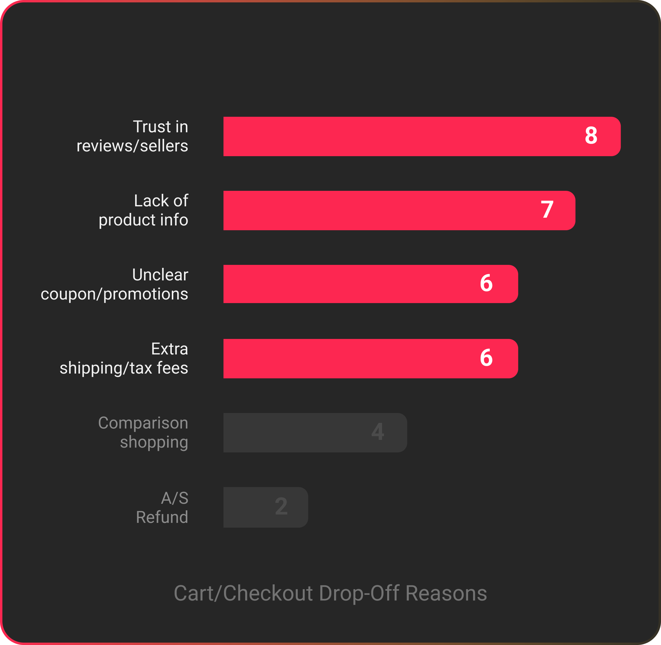
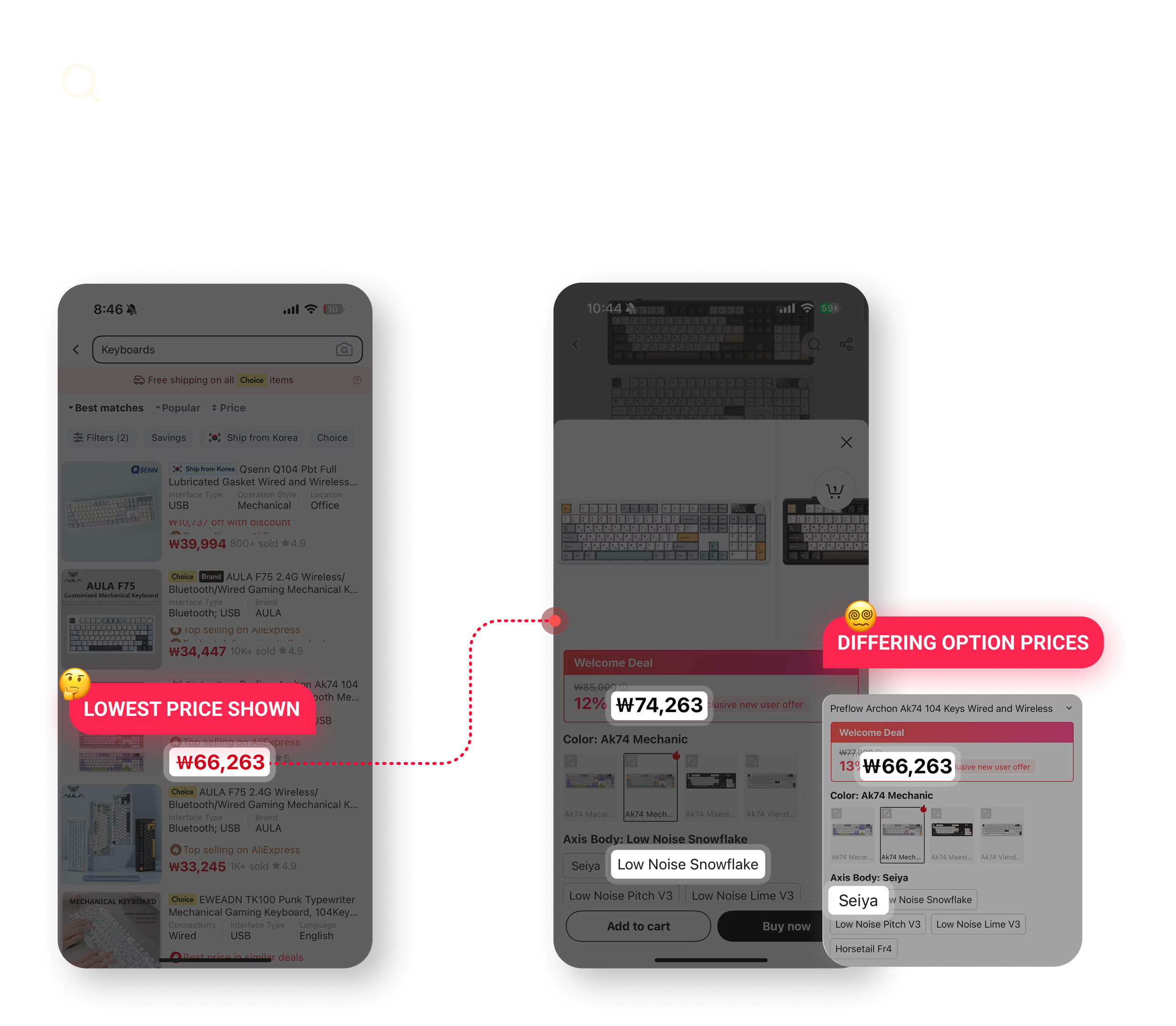
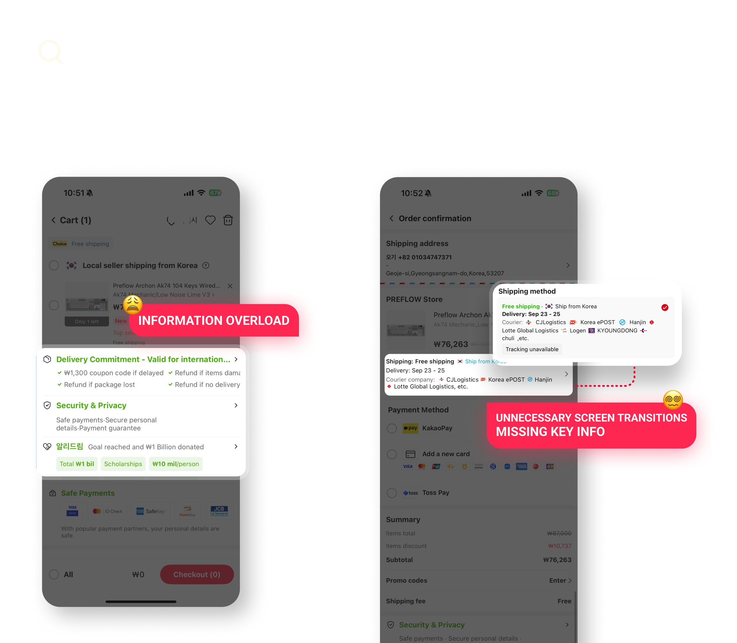
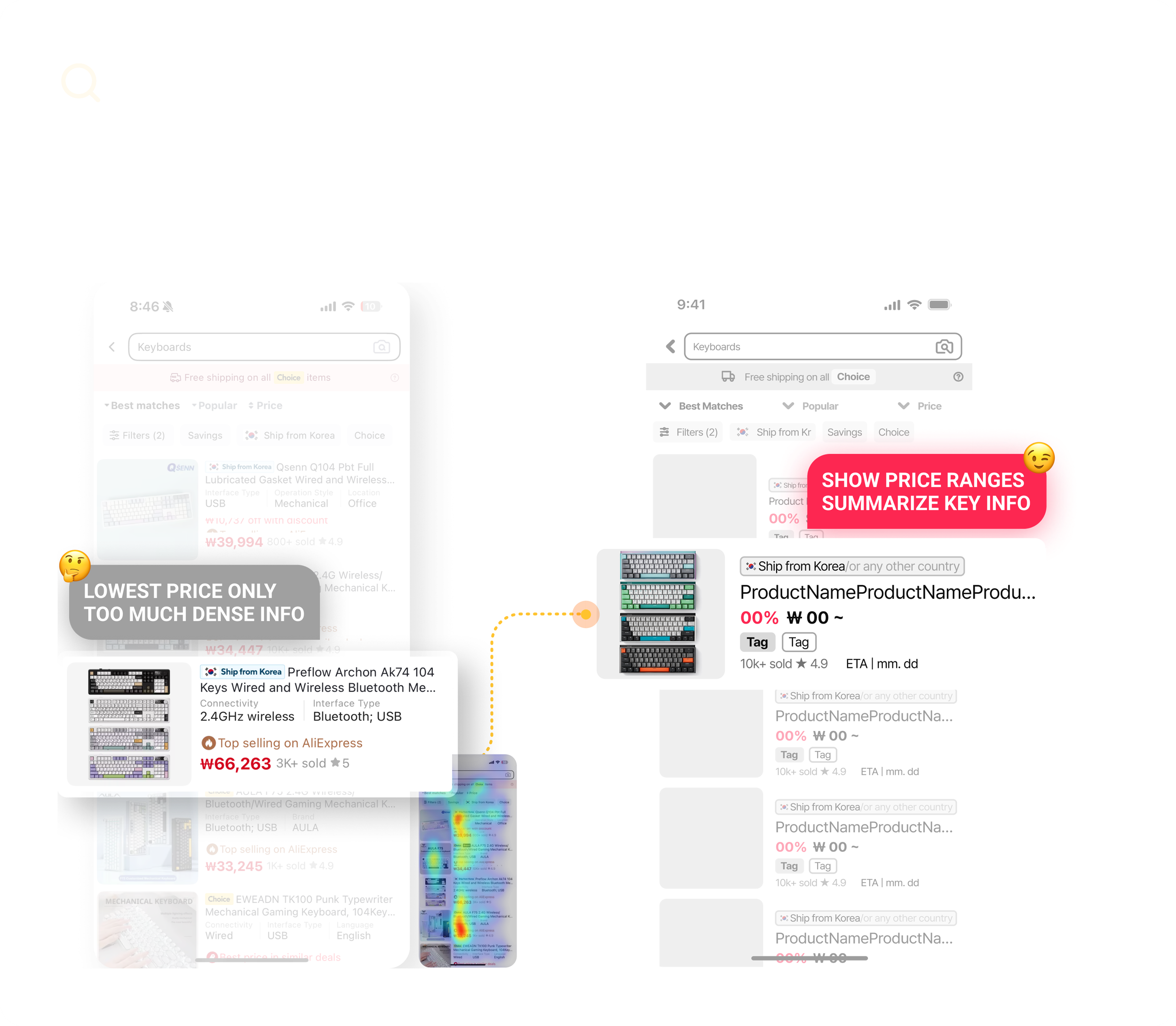
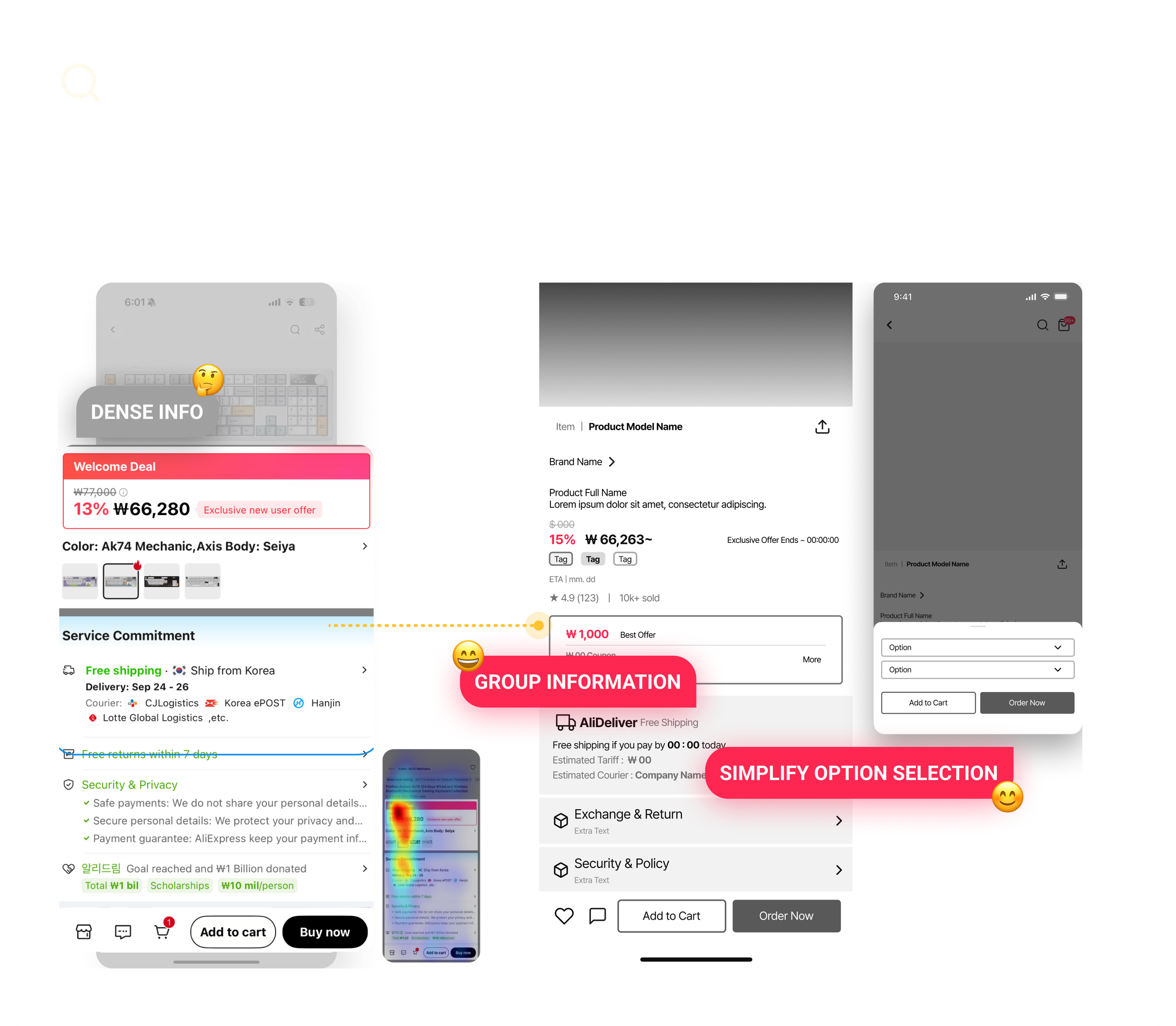
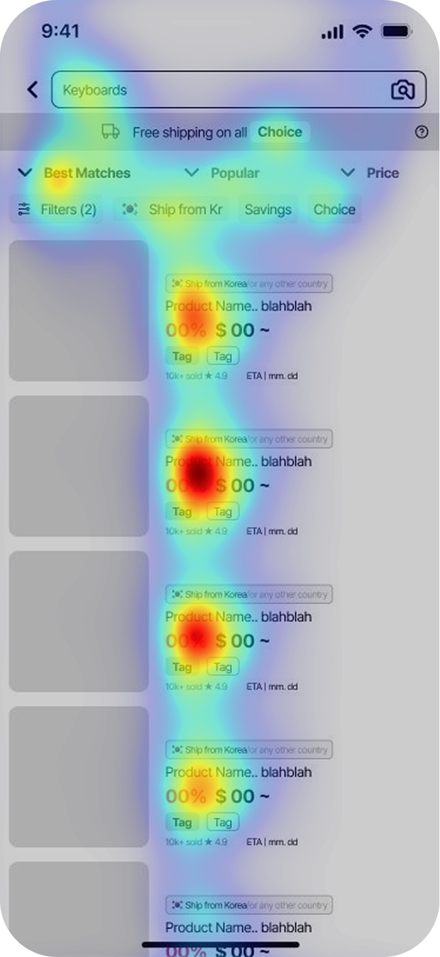
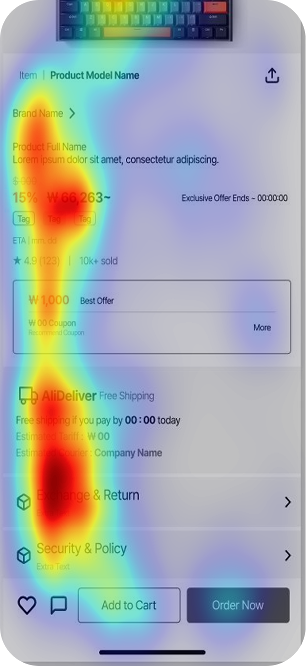
The biggest pain point is confusion in the structure and visual hierarchy during the cart and checkout process.
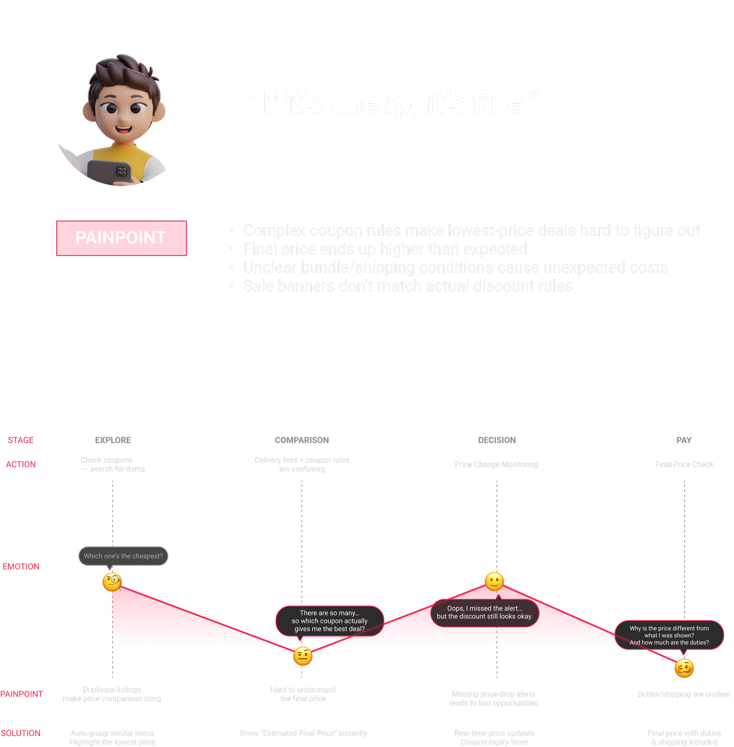
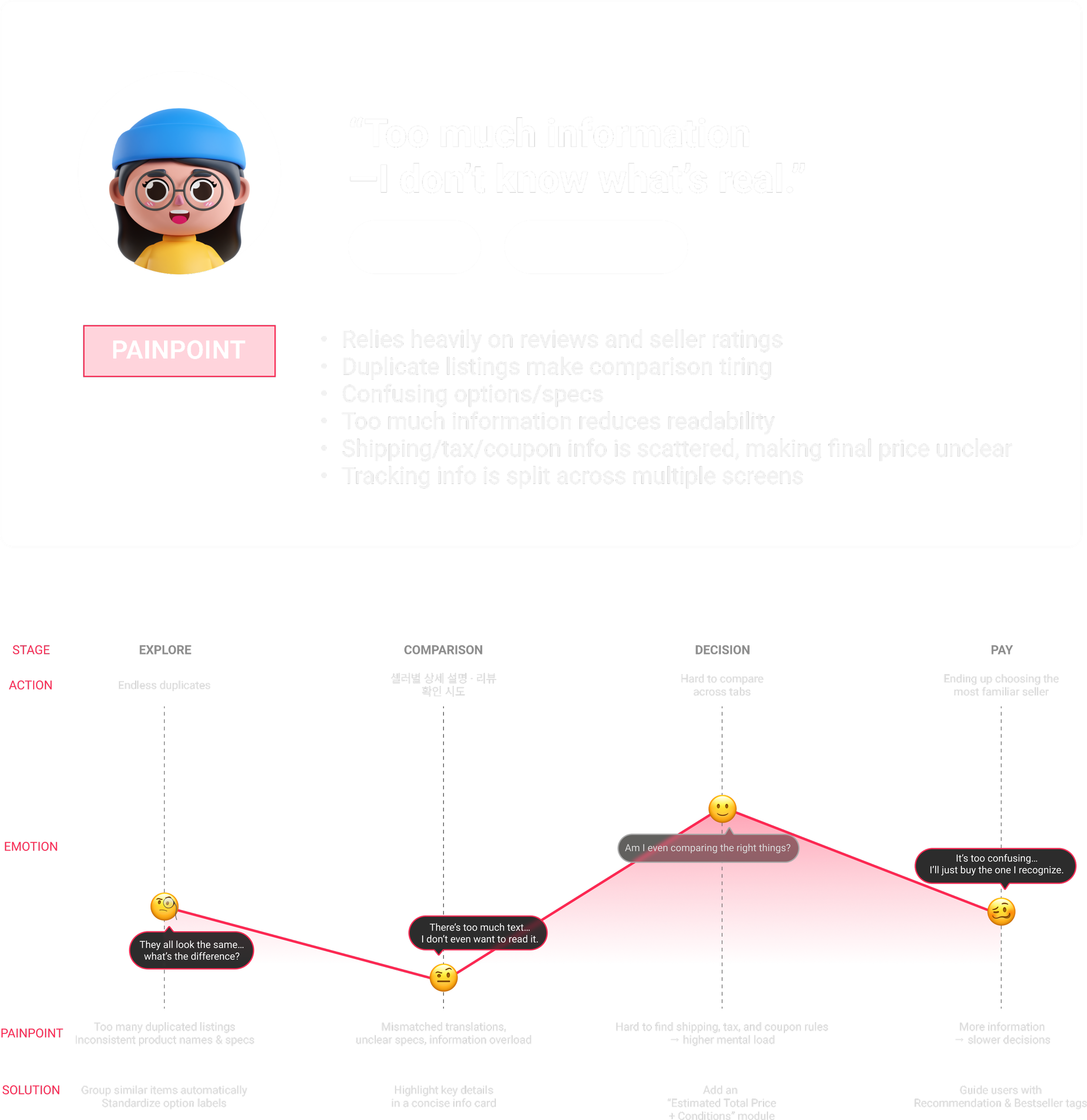

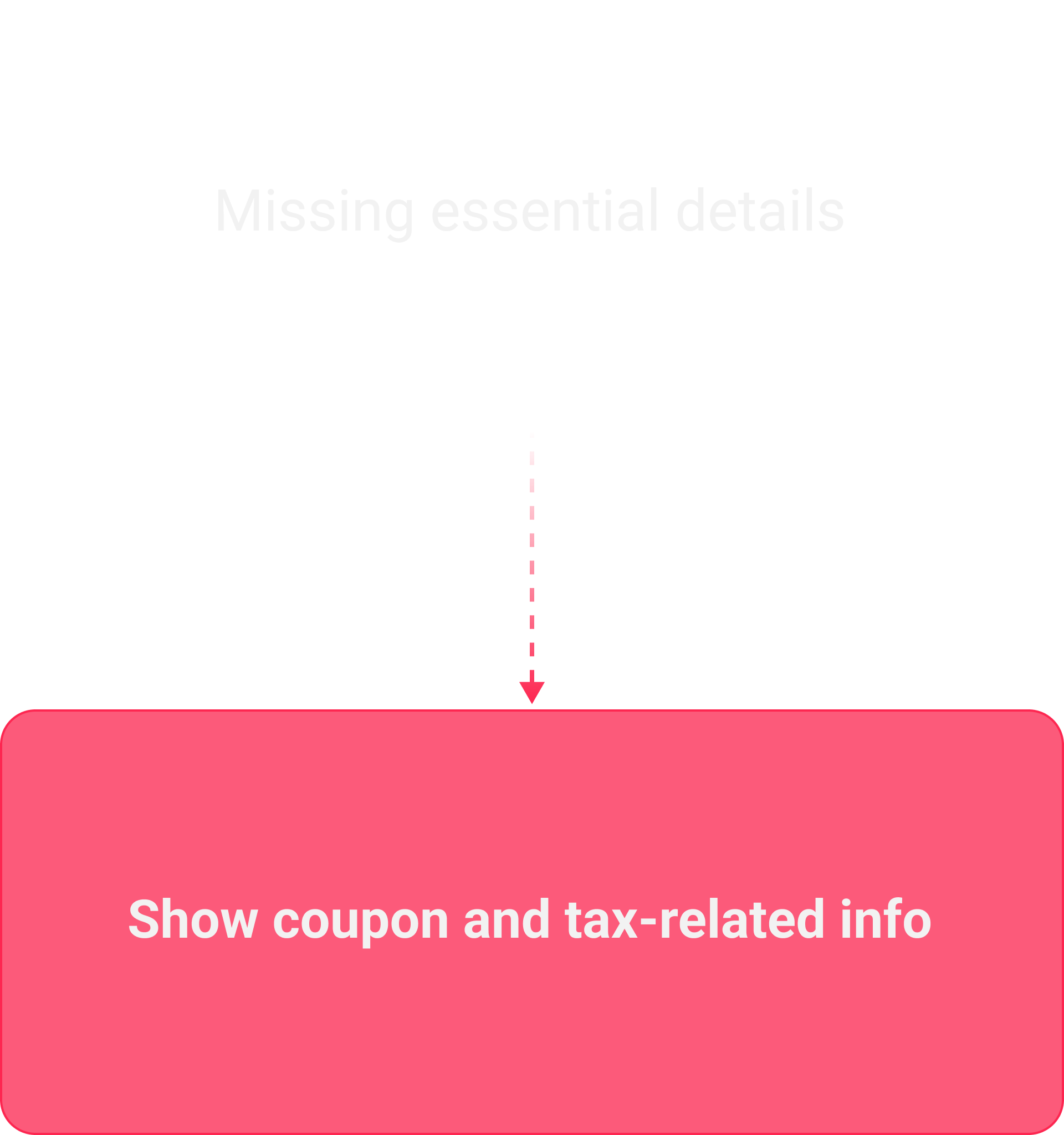
Scattered shipping, tax, and coupon info
make the final price unclear, causing checkout drop-offs.
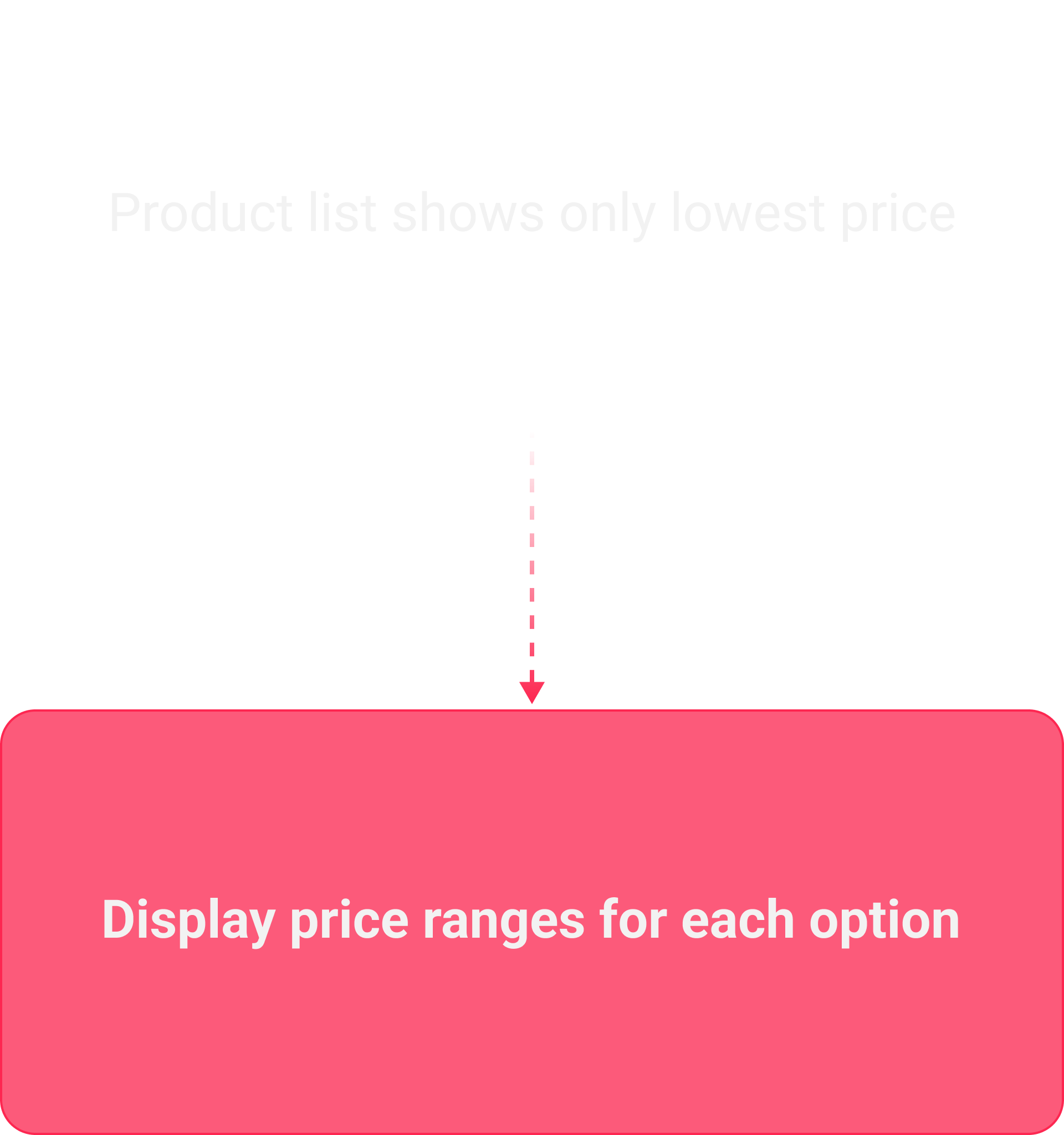
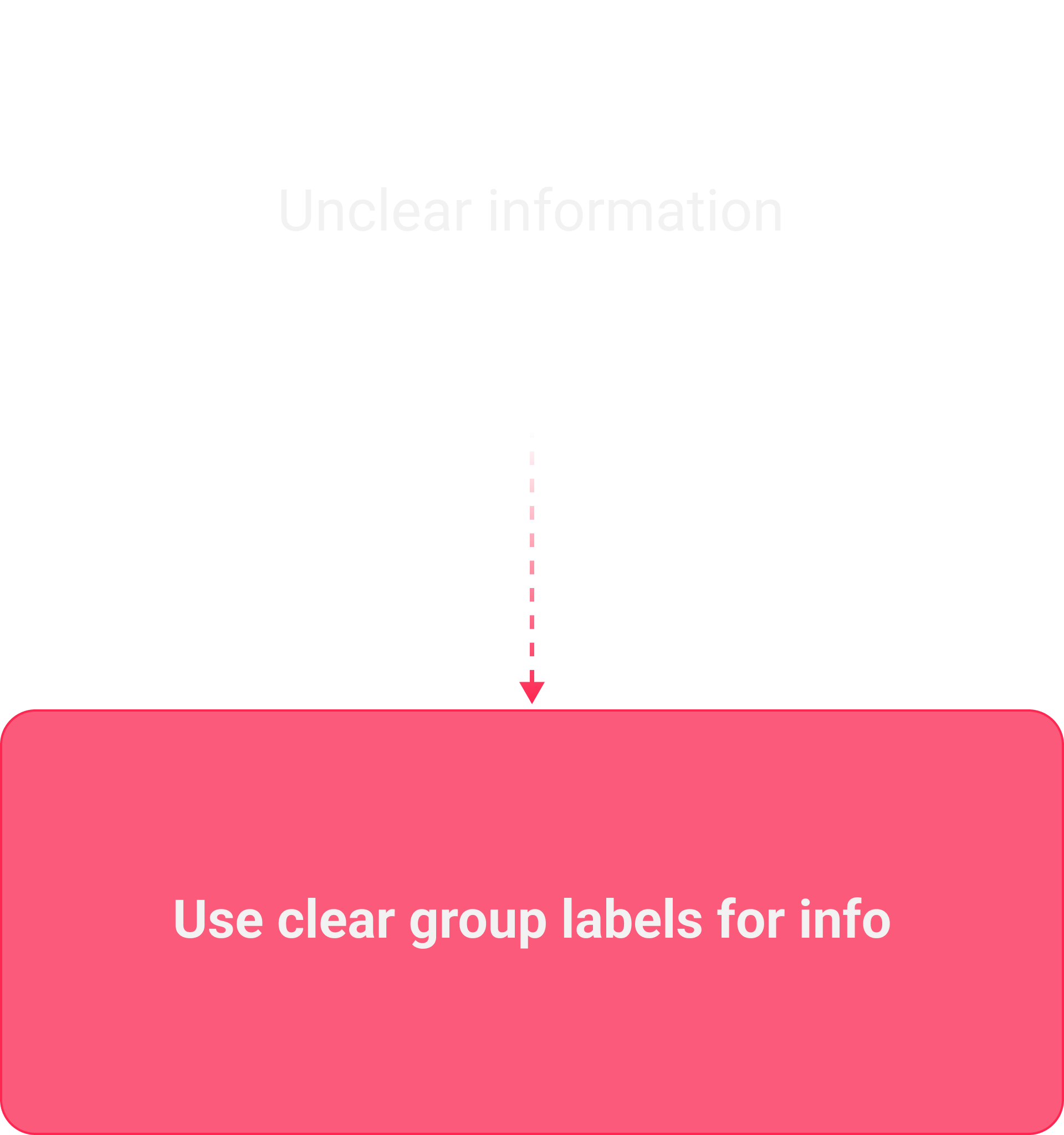
I designed a UX that highlights key info that users most need
and shows the final price clearly, helping users purchase with confidence.
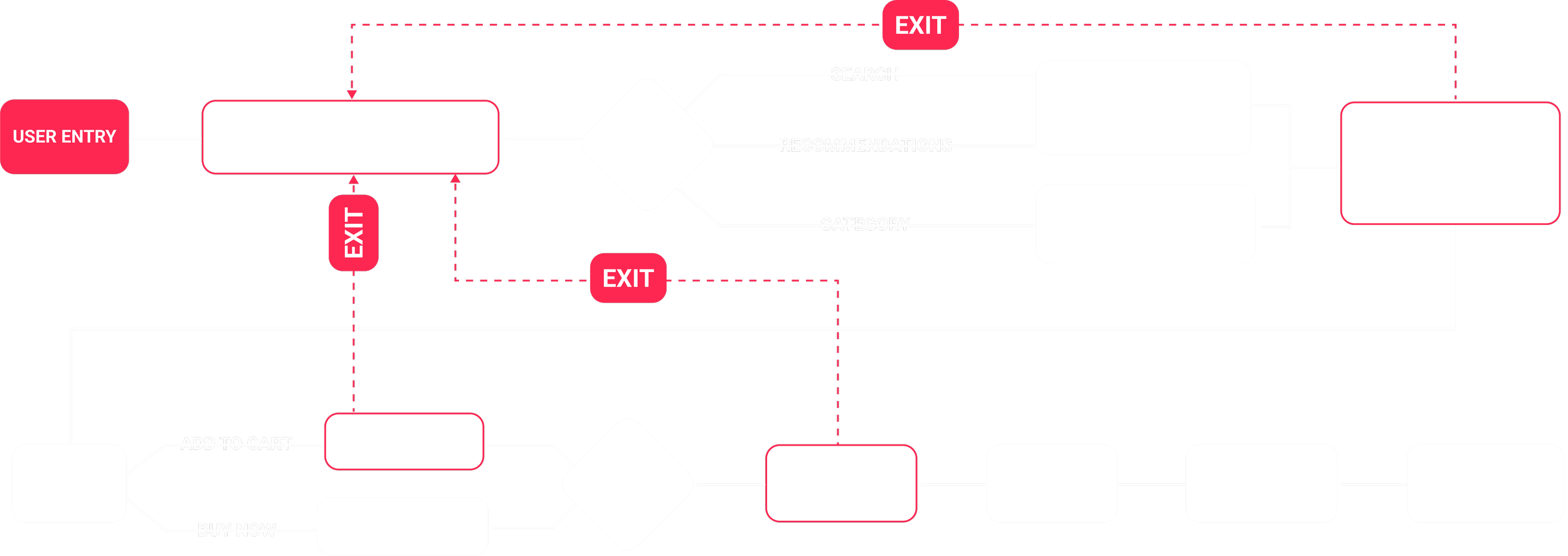
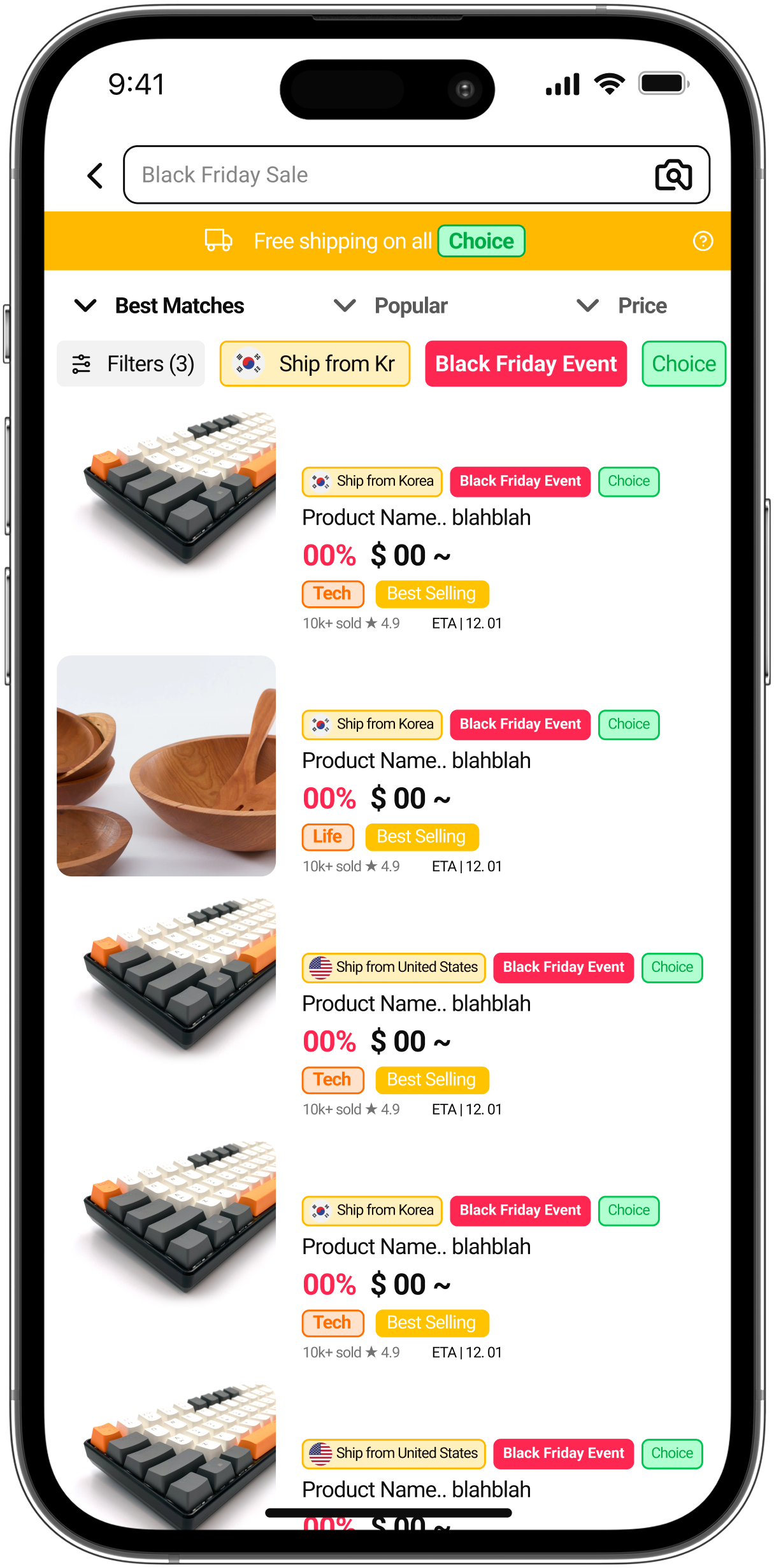
AS - IS
AS - IS USER FLOW
SOLUTION
HOW TO SOLVE
TO-BE USER FLOW
RESULT AND IMPACT
22%
Clarity Ranges
→
55%
Clarity Ranges
44%
→
55%